
Eglass Website Remodel
Summary: Eglass railing is an ecommerce site where people can purchase DIY glass railing. The company has been having difficulties making sales for years. The website was made in 2010 and was designed to rank on the SERP, not for usability. The site was producing low conversion, high bounce rates and something needed to be done before the business was at a total loss.
Overview
Roles & Responsibilities
I acted as the project manager and lead UX designer.
I conducted the visual design, audit of the old site, user research, user interviews, usability tests and presenting to stakeholders.
Audience
Eglass customers, business owners, Eglass Marketing team, Yahoo! rep, RTML developer and sales teams.
Problem
The current website design has an extremely high bounce rate in spite of being ranked number 3 for glass railing systems on google. The company is at a loss as to why leads aren’t generating sales.
Solution
I worked with a Yahoo! rep to audit the current site and establish the key variables that contributed to making ecommerce sales. We created a site that was visually focused, gave the user ease as they shopped and made it easy to know how to order.
Discovery & Research

The old site …
The old site was overwhelming to view at first glance. It wasn’t shocking to me that the bounce rate was so high given that when opening the homepage I felt the need to react. Moving past my initial impression I analyzed the key themes about the page that seemed to be begging for my attention. The bright red phone number, the get an estimate button and the revolving banner all overwhelmed my senses but it got the point across that I should interact with those areas of the screen above all else.

Do people buy glass railing online?
Glass railing is a complicated product. The are many things to consider when purchasing, it’s expensive and installing it can be intimidating. The easiest way to order is by talking with an estimator and letting them tell you everything you need to buy. The website’s purpose acts as a lead generator for the sales team. Although you can purchase glass railing products through the site, the goal for this ecommerce site isn’t to fill a cart and check out.

How can the site support sales teams?
The Eglass Sales team is small, when the phones start ringing there are one or two people who answer the line. The more weight that the site can pull as far as answering questions, making the options clear and filtering out people who aren’t ready to buy the better. Customer service, speed of delivery and maintaining a high average order amount are important to the sales team.
Data
To gain insight into how to approach this project I looked into Google Analytics.
I used Analytics to discover the gender, age range and common interests of our users. From that I looked into popular sites that are visited by people in that age range. I also did competitive research on other railing sites as well as commonly used ecommerce sites.
I also looked into the users flow to see what people were doing when they interacted with the existing site.
The new site went live on March 16th so I compared data from the month prior to the launch to the month after launch

Users Flow
I recorded the users flow for the month prior to when we launched the redesign to see if there were any changes in the sessions to drop off ratio. I looked at the 1st and 2nd interaction pages to get a better understanding of the type of information users were seeking on the existing site.

Affinity Category
This information carved the path for my competitive analysis. Knowing the other types of pages that users are visiting around the time they came across our site tells me what else they are asking questions about, the style of sites they are used to and if there is a way to display the product to them in a way that resonates.
User Surveys
After taking a user survey I found several common user pain points on the existing site.
It felt cluttered and like a task just to look at the product due to lots of writing.
Also many users weren’t filling out the form entirely so the leads were soft and the staff felt their time was being wasted. (Check Eglass Estimate Form)
I considered all of these pain points when redesigning the site. I wanted to make it more visual, direct the users eye to the “get a free estimate” button and create an estimate form that was laid out in a way that was less intimidating.

Competitive Analysis


User Personas

I don’t know what I want vs.
Thinking about someone who is window shopping and may not know things like what a facia bracket is or what style of top rail to consider were important people to consider when designing the site. This type of person needs the difference between products made clear, they will need lots of help figuring out what to buy and will need photos to learn what look meets their vision.

I know what I want
Many homeowners will hire contractors who need things shipped fast or have many different vendors offering them discounts. This type of customer might want to just buy parts, get an order shipped as fast as possible and may not need access to as many photos.
User Flows
I looked into the motivations for each persona based off of what they expect from the process of purchasing glass railing.

Wireframes
For my wireframes I focused on getting the layout of photos and thinking about what the user wants to see as they move along their journey to purchasing the product. I thought about both of my personas and what aspects of design would be most beneficial to them.


Brand Development
I used colors from the company logo to create the palette used for the site. The company had a set of branding parameters that I followed when making site designs.
Mockup 1


Usability Tests
When I finished the first mockup I did an initial round of user testing using contractors and people who had never ordered railing before. From the user tests I gathered that this design still left people confused on how to order, the call to action wasn’t clear enough, the contrast needed to be better and that people weren’t fans of the pastel color palette. People shared that it still felt text heavy and they didn’t feel like they were having a shopping experience. They found the icon bar and the “Eglass Advantage” to be confusing and weren’t sure why it was relevant. People shared that they didn’t desire to know the installation options, they wanted direct links to the the parts used.
When the first design was shown to stakeholders they didn’t like the organic shape in the banner and felt the image used didn’t give off the emotion that they wanted users to have when they entered the site.
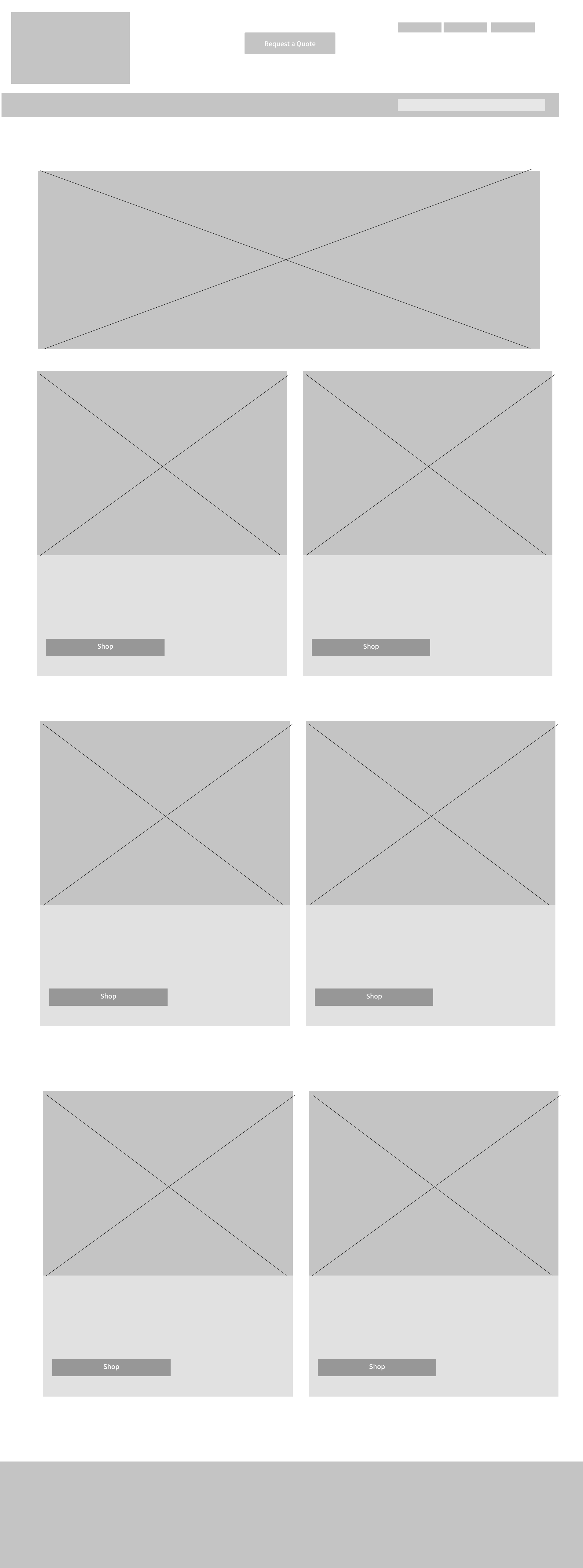
So I took the feedback that I was given and designed a new layout inspired by the first mock up. I made it so that there was minimal reading required and that the pages were centered around images that helped tell the story of each railing system. I designed it so that as the user scrolls they are given words that highlight reasons to purchase and answer common questions without having to search the site.
Final Prototypes


Conclusion
For this project, I learned so much! I took it on initially expecting to only do the estimate form then that turned into the opportunity to lead the redesign of the entire website. For my second UX project this was a fully immersive experience getting to work with developers, reps and put into practice what I was learning in my Thinkful program. For this site the foundation of the user flows and site map remained the same as the pre existing site.
My main objective was to decrease the bounce rate and make a site that people didn’t immediately navigate away from.
After looking at the metrics from the month after launch the conversion ratio went from 1.7 to 2.8, a significant change from where it was at before. With other changes within the company the sales rate went from 10% up to 30% in the last few weeks.
I got hired for this job while I was in the beginning phases of my UX course, it’s been amazing to be able to work as a digital marketing specialist where I generate leads using ad campaign strategies then following the user journey all the way to when their order ships.
This project exposed a wide range of projects that could be done for this company, exposed my unique skills and challenged me to understand a market that I had never gotten the experience to work with in the past.

